Why the Campaign Toolkit Switched to Illustrated Menus
The Family RPG Campaign Toolkit began with practical button menus. They worked, but they never felt like the final home for a tool built around Damsels, Adventurers, and Dragons, Ghosts of Vietnam, and the larger Family RPG System.
The new launcher moves the Toolkit toward illustrated game-line menus, where the user chooses a line, moves through a scene, and sees available tools highlighted in context. It is still a desktop utility, but it now feels more like opening a campaign workspace than staring at a flat list of buttons.
Why the Old Button Menus Had to Go
The older menus were functional. They exposed the tools directly, they were easy to test during development, and they made the basic Toolkit structure obvious. For a working build, that mattered.
But functional was not enough. The old menus felt too much like temporary utility screens. They did not communicate the identity of DAD or GOV, and they did not give the user the feeling of entering a campaign workspace. DAD and GOV have different moods, different kinds of records, and different table needs. The menus needed to show that difference before the user opened a single tool.
The Old Software Inspiration
The redesign was inspired by the spirit of older desktop RPG companion software, especially the visual menu approach remembered from the AD&D 2E Core Rules Expansion era. That inspiration is not a copy of those programs, and it is not an affiliation, license, endorsement, or asset reuse.
The useful idea is simpler than that: an RPG utility can feel like a table, desk, book, binder, map case, or campaign space instead of a spreadsheet launcher. The Toolkit is built around game lines, records, maps, rosters, characters, NPCs, expeditions, and campaign binders. The menu should feel like the door into that work.
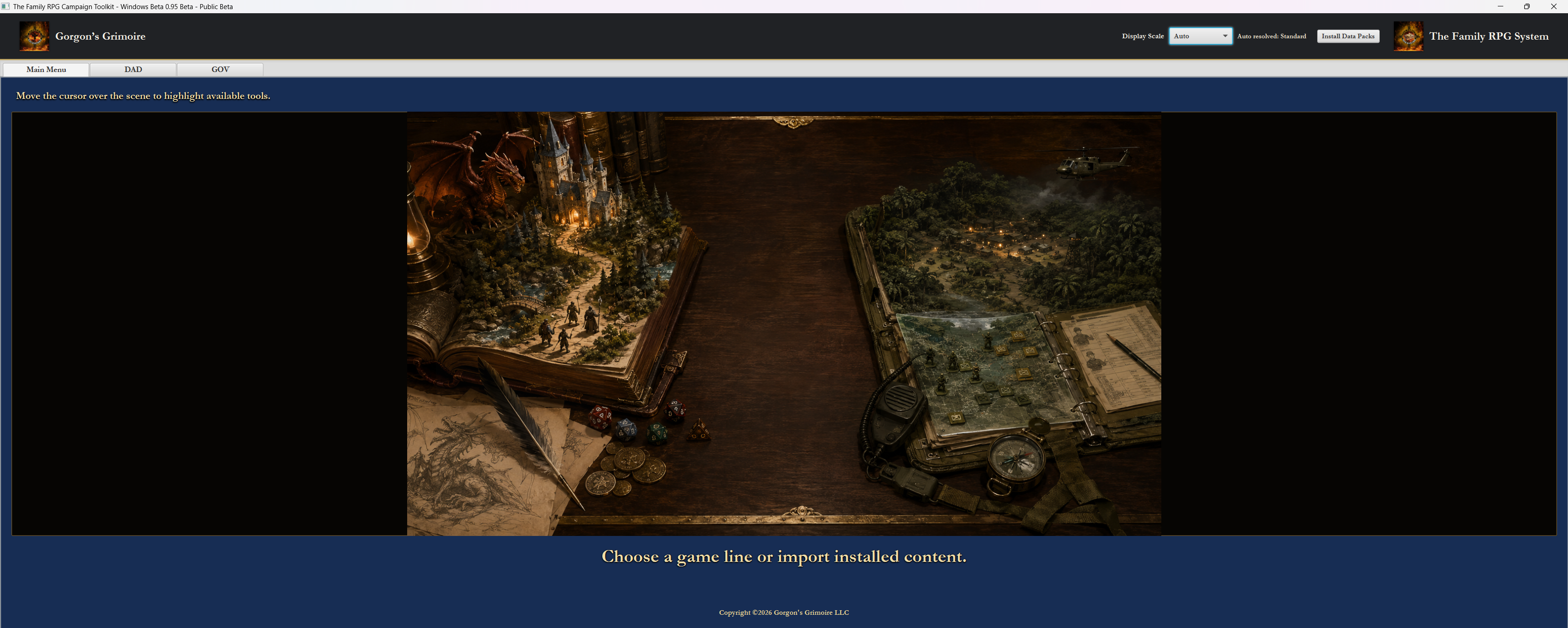
The New Main Menu
The first screen now lets the user choose between DAD, GOV, and installed or imported content. Installed or imported content represents newer paid packs or data packs that can be brought into the Toolkit later. The user is not dropped into every tool at once. The launcher establishes the Toolkit as a family of game lines rather than a single generic app.
DAD and GOV are separated at the top level because they have different moods, genres, and workflows. Choosing the main menu option is meant to feel like choosing which book, binder, or campaign case to open.
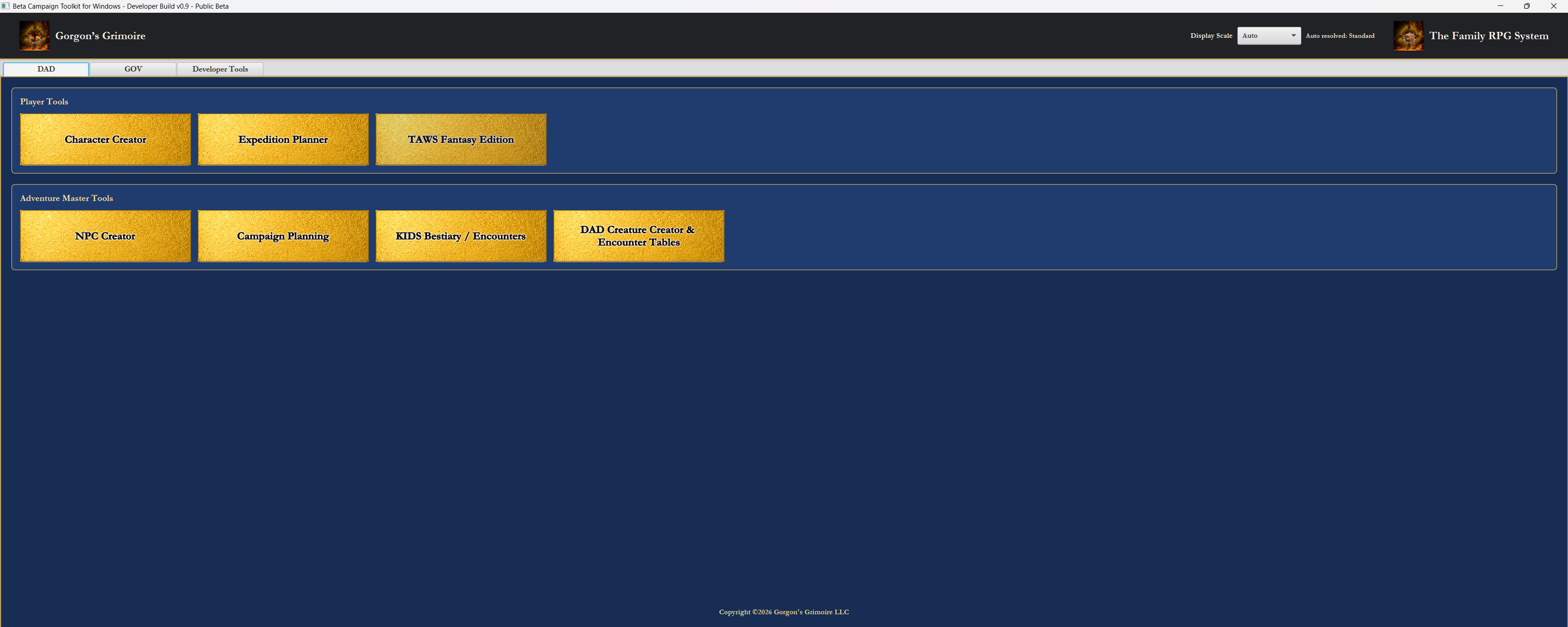
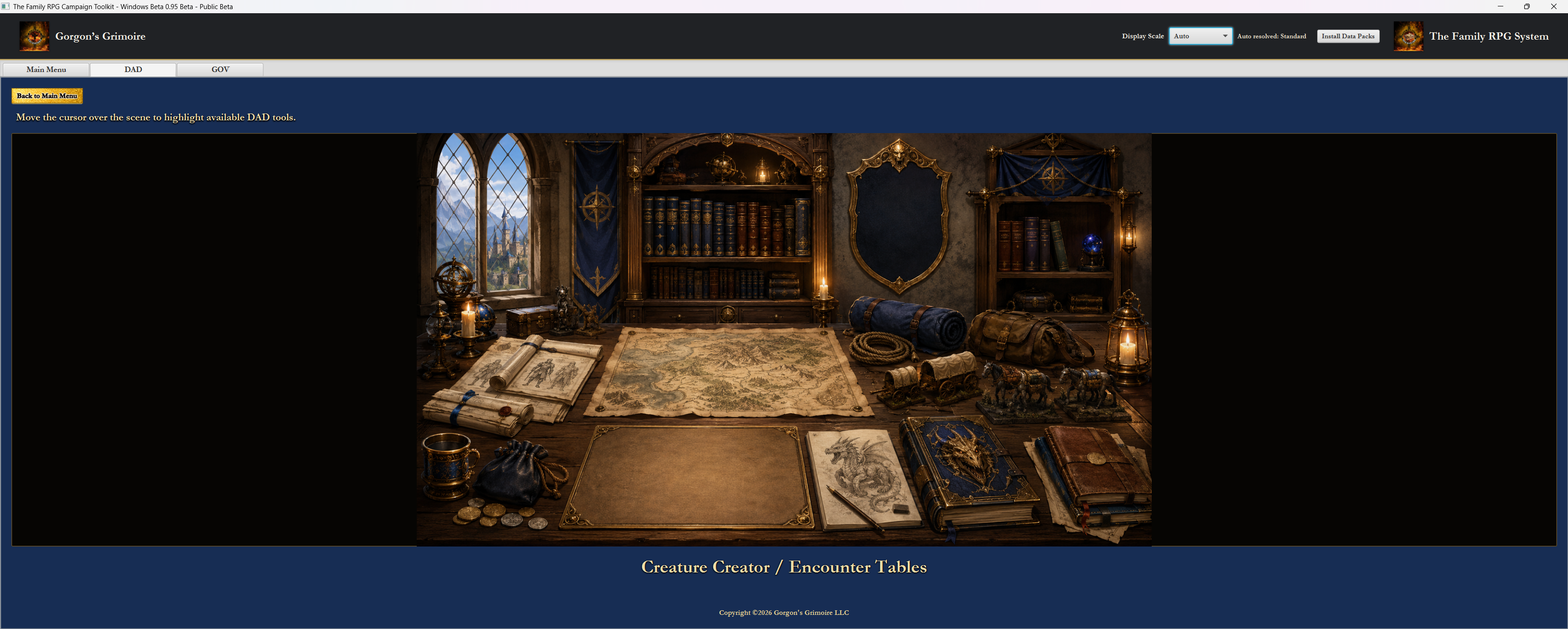
The New DAD Menu
The DAD menu uses an illustrated fantasy workspace. Tools are available through scene hot spots, and moving the cursor over the scene highlights available tools. The title of the highlighted tool appears at the bottom of the screen.
That keeps discovery clear while making the menu feel like a fantasy campaign desk instead of a flat utility panel. DAD tools live in a space that visually matches fantasy adventure, maps, books, creatures, expeditions, and Adventure Master preparation.
The DAD side includes the Character Creator, Expedition Planner, TAWS Fantasy Edition, NPC Creator, Campaign Planning, KIDS Bestiary / Encounters, and DAD Creature Creator & Encounter Tables where appropriate. TAWS Fantasy Edition and future support are represented as part of the Toolkit structure without claiming every module is finished. The bookcase also gives future supplements a natural place to live as the line grows.
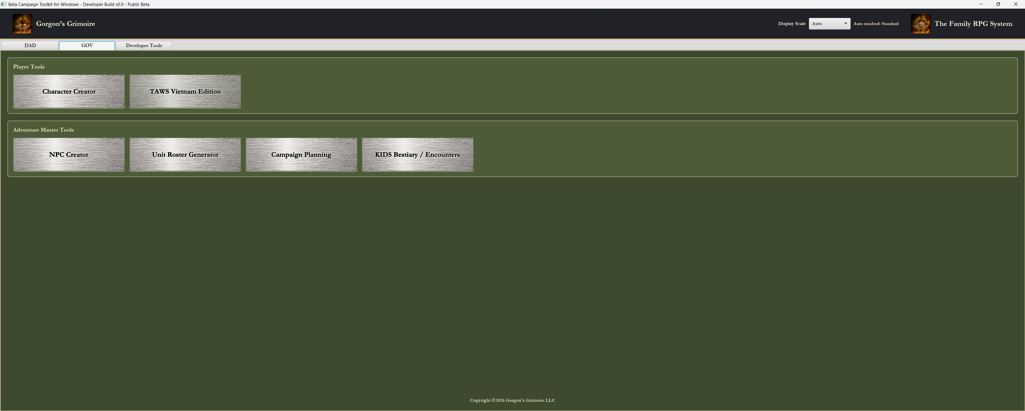
The New GOV Menu
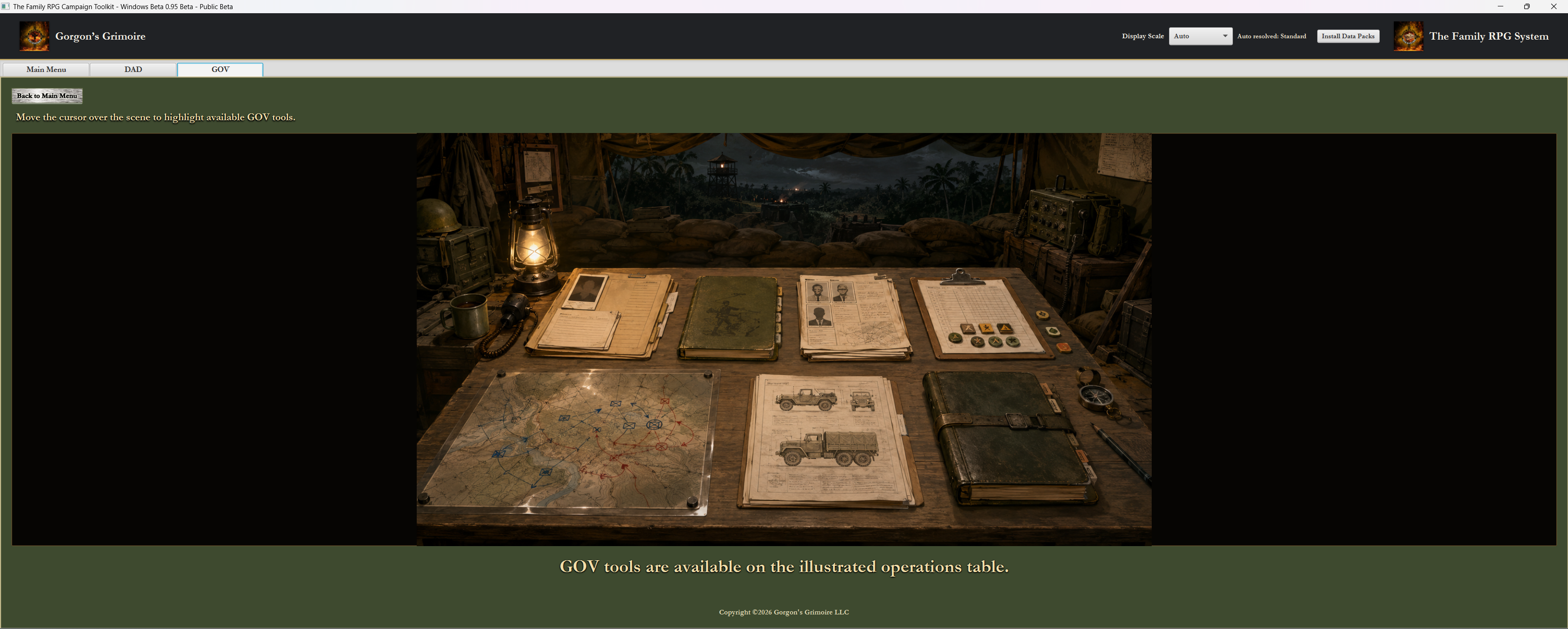
The GOV menu uses an operations-table scene. GOV tools are presented in a Vietnam War campaign workspace rather than a fantasy workspace, with hot spots that highlight tools and show the current tool title at the bottom of the screen.
The menu communicates rosters, operations, mission planning, records, unit support, and campaign logistics. GOV is not merely a reskin of DAD. It has its own organization and visual identity because Ghosts of Vietnam play is organized around characters, units, missions, terrain, personnel records, and operational pressure.
The GOV side includes the Character Creator, TAWS Vietnam Edition, NPC Creator, Unit Roster Generator, Campaign Planning, and KIDS Bestiary / Encounters where appropriate.
Hot Spots Instead of Button Rows
The illustrated menus use clickable hot spots instead of ordinary button rows. Hovering over a scene highlights available tools, and the current tool name appears at the bottom of the screen. The interface gets a visual exploration feel without hiding functionality.
The user still gets clear feedback. The design remains desktop-first, mouse-friendly, and direct. The hot spots are not there to make the Toolkit mysterious. They are there to make the tool selection feel connected to the world and work of each game line.
Why This Fits the Toolkit
The Toolkit is not a phone app, and it is not trying to imitate mobile-first web design. It is a desktop campaign companion. DAD and GOV are tabletop games with records, maps, rosters, characters, NPCs, expeditions, operations, and campaign binders. The interface should feel like a campaign space, not a generic settings screen.
That fits the same old-web publisher instinct behind Gorgon’s Grimoire: practical, readable, a little tactile, and pointed toward play. The goal is not decoration for its own sake. The goal is a menu system that helps the user feel which game line they have entered and what kind of work they are about to do.
Closing
The illustrated menus bring the Toolkit closer to its intended identity: a desktop-first Family RPG System campaign companion where each game line has its own visual space, its own tools, and its own way of preparing for play.
DAD should feel like opening the fantasy campaign desk. GOV should feel like stepping into an operations table. The Toolkit should make the user feel the difference before the first character, roster, expedition, or campaign record is opened.
Toolkit Articles The Family RPG Campaign Toolkit Articles & Essays